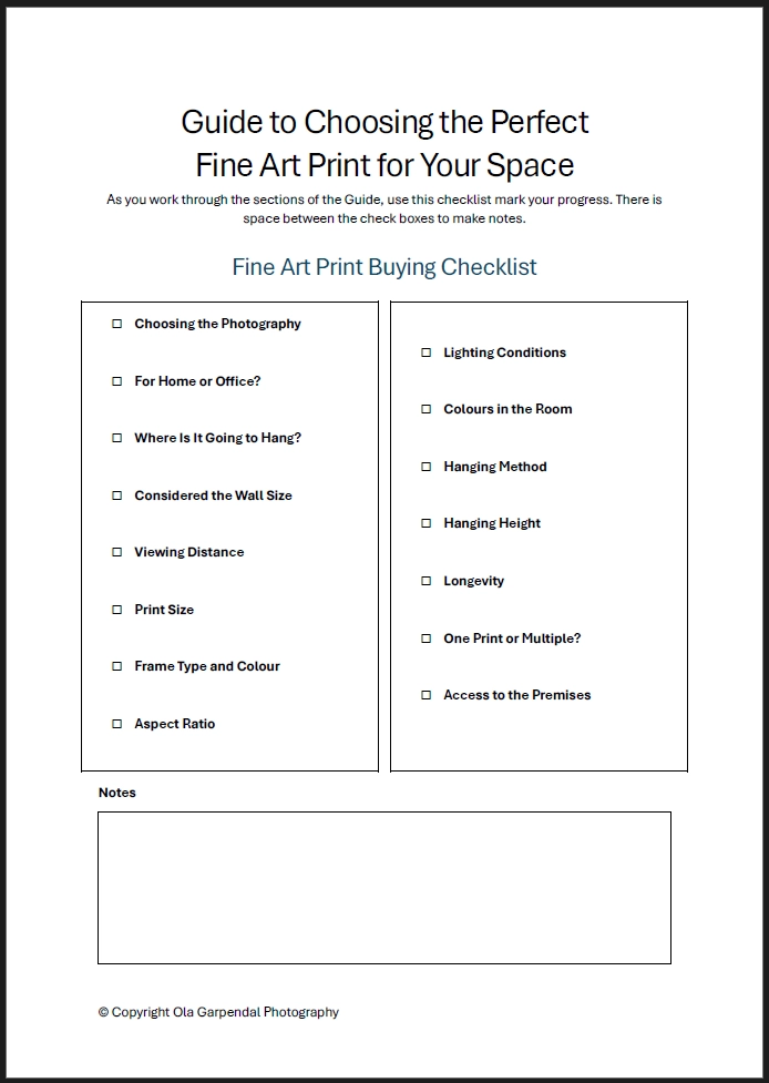
Guide to Choosing the Perfect Fine Art Print for Your Space
Selecting a fine art print is often an emotional decision—an image that speaks to you, evokes a memory, or captures a place you love. But choosing the right print for your space involves more than falling in love with a photograph. The room, the wall, the lighting, and even the way you’ll hang the piece all play a role in how the artwork will look and feel once it’s on your wall.
This guide walks you through the key considerations so you can make a confident, informed choice and enjoy your print for years to come.
Resources to Help You
To help you select the photograph for your space, there are the Shop and the Galleries, where you can browse through the collection. When you have chosen the photograph, we can help you ‘see’ it in your room. If you need any other help, don’t hesitate to reach out to us.
Shop
The shop contains the full collection of photographs. A handy filter set will help you narrow the selection to what is specific to you.
Galleries
The five galleries show selections of photographs related to a style or location.
Artwork Placement Preview
Uncertain about how the print will look on your wall?
Contact
Need more help? We would love to discuss your preferences and requirements.
Choosing the Photograph
The right photograph is rarely just decoration — it carries meaning, evokes a feeling, or anchors a room. Before browsing, it helps to ask yourself a few honest questions.
What draws you to this piece? Are you selecting a print of a place you’ve visited and want to remember? Perhaps a landscape you stood in, a light you’ll never forget, or a moment that still stays with you. Or is it a destination you dream of seeing — somewhere on your list that you want to live with before you ever arrive?
Sometimes the pull is less about place and more about feeling. Are you choosing a piece for its mood, colours, or sense of calm? A photograph that quiets a room, adds warmth, or simply holds your attention for the right reasons can be just as powerful as one tied to a memory.
Where will it live? Consider whether the artwork is for your home or your workplace — the answer shapes everything from scale to subject matter. A home invites the personal and the atmospheric; a workspace often benefits from something that inspires without demanding attention. Think about the light in the room, the colours already present, and whether you want the photograph to harmonise with its surroundings or stand apart from them.
Narrowing your search Once you have a sense of the emotional purpose — what you want the piece to do, and where it will hang — the practical choices become clearer. Subject matter, colour palette, mood, and orientation all follow from that starting point.
The Galleries show images of a similar style or from a similar location, displayed together so you can get a feel for how a body of work holds together. Browsing a gallery is often the best way to find something you didn’t know you were looking for.
When you’re ready to explore the full collection, head to the Shop. Use the filters to focus your search by category, location, and aspect ratio — particularly useful if you already have a wall space in mind and need a specific orientation or proportion.
Home or Office?
Where a photograph will hang shapes the experience of living with it — and it’s worth thinking beyond the wall itself.
In a home, you have the freedom to be personal. A print can carry memory, emotion, or simply a quality of light that makes a room feel right. Whether it’s something calming for a bedroom, expansive for a living space, or quietly intriguing for a hallway, the best choice is often the one that still holds your attention months later.
In a workplace, the considerations shift. A well-chosen photograph can set the tone of a room — professional without being cold, inspiring without being distracting. It might reflect something about your values or the nature of your work, or simply create an atmosphere that makes the space more human. If clients or colleagues will see it, that context is worth factoring in too.
In either setting, the scale of the print matters as much as the image itself — a consideration covered in the next section.
Where Is It Going To Hang?
Before settling on a print, spend a moment with the room itself — not just the wall, but the space as a whole.
A large, open room can carry a substantial print with ease; the same piece in a narrow hallway or compact study might feel imposing. Equally, a smaller print that works beautifully as part of a curated arrangement can feel adrift on a wide, bare wall. Scale is always relative.
Think about what role you want the artwork to play. Is it the focal point of the room — the first thing the eye travels to? Or is it part of a larger arrangement, contributing to a mood rather than anchoring it? Both are valid approaches, but they lead to different choices in size, subject matter, and framing.
It’s also worth considering the orientation of the wall space available. A tall, narrow wall favours a portrait-oriented print or a vertical arrangement; a wide wall suits landscape orientations or a horizontal grouping. Matching the shape of the print to the shape of the space tends to feel more resolved.
The Artwork Placement Preview service can help you test a print in your actual space before committing — upload a photo of your room and see how a piece looks at scale on your wall. It takes the guesswork out of one of the harder parts of the decision.
Wall Size
The dimensions of your wall are one of the most reliable guides to print size — and it’s worth taking them seriously before you fall in love with a specific piece.
A print that’s too small for the space will feel incidental, like an afterthought on an otherwise empty wall. One that’s too large can close a room in or compete uncomfortably with the architecture around it. Neither does the photograph justice.
As a general starting point, a print should occupy roughly two-thirds to three-quarters of the available wall width for a balanced, considered look — though this shifts depending on whether the piece stands alone or sits within a larger arrangement.
If you’re unsure, the free Artwork Placement Preview service takes the guesswork out of it entirely. Upload a photo of your wall and see exactly how different print sizes will look in your space before you commit to anything.
Viewing Distance
The distance between the artwork and the viewer is just as important as the size of the wall — and it’s easy to overlook.
When furniture, room layout, or the function of a space means people will naturally stand or sit several metres away, a larger print is needed to hold its presence. Viewed from a distance, a smaller piece can lose its impact entirely — the detail, the mood, and the sense of scale all diminish as you step back.
In closer quarters — a hallway, a reading nook, or a compact room where you’ll pass by or pause nearby — a medium or smaller print often feels more natural and more intimate. There’s something to be said for artwork that rewards proximity.
A useful rule of thumb: the optimal viewing distance for a print is roughly 1.5 to 2 times its longest dimension. A 100cm wide print, for example, tends to read best from around 150–200cm away. If your room doesn’t allow for that distance, a smaller print will likely serve the space better.
Print Size
By this point you have three reference points to work with: the size of the room, the dimensions of the wall, and the distance from which the print will typically be viewed. Taken together, they’ll point you toward a size range more reliably than any single measurement on its own.
When a print will hang above furniture — a sofa, console table, sideboard, or bed — there’s a widely used guideline worth following: aim for the print width to be approximately two-thirds of the width of the furniture beneath it. This keeps the relationship between the artwork and the furniture visually balanced, and avoids the wall feeling either top-heavy or underfilled.
For prints that will hang in open wall space without furniture below, the two-thirds-of-wall-width principle from the Wall Size section applies — adjusted up or down depending on whether the piece stands alone or forms part of a larger grouping.
If you’re still uncertain after working through these considerations, the Artwork Placement Preview service is the most direct way to resolve it — upload a photo of your space and see how a specific print size actually looks on your wall before committing.
Frame Type
The right frame does two things quietly: it complements the artwork, and it belongs in the room. A frame that fights with either tends to draw attention to itself rather than to the photograph.
Four framing options are available, each with a distinct character:
Acrylic Float Frame — The print is mounted behind a sheet of acrylic with a treated aluminium backing. The result is sleek and contemporary, with the print appearing to float within the frame. It works particularly well in modern or minimalist interiors where clean lines and a light visual weight are a priority.
Black Timber Box Frame — A classic choice that adds definition and a degree of formality. Black framing draws the eye inward and tends to suit moody, high-contrast, or monochromatic images, as well as interiors with darker tones or strong architectural features.
Raw Oak Timber Box Frame — Warm and natural in character, raw oak softens the presentation of a print and sits comfortably in interiors with timber, linen, or earthy tones. A good choice for landscapes and nature photography where the frame can echo the subject matter.
White Timber Box Frame — Clean and versatile, white framing keeps the focus firmly on the image and suits lighter, more neutral interiors. It works across a wide range of subjects and tends to feel at home in Scandinavian-influenced or coastal spaces.
All box frames are constructed with a spacer between the print and the glazing, creating a subtle depth that lifts the artwork off the backboard.
Each print is shown in all four framing options in the Shop, so you can compare directly before deciding. If you’d like to see a specific frame in your own space, the Artwork Placement Preview service can provide alternative frame previews alongside the print itself..
Aspect Ratio
Aspect ratio describes the proportional relationship between the width and height of a print — a 1:3 ratio, for example, means the long side is three times the length of the short side. It’s not something you choose independently; rather, it’s determined by the photograph itself and the way it was composed. Understanding aspect ratio helps you identify which prints in the collection will suit your wall space and intended arrangement.
Different proportions create noticeably different visual impressions:
3:2 and 2:3 — The 3:2 ratio is the classic photographic proportion, familiar and balanced. In portrait orientation (3:2) it suits tall, narrow wall spaces; in landscape orientation (2:3) it works well above furniture or on wider walls. These are the most versatile formats in the collection.
1:2 and 2:5 — Moderately elongated, these ratios feel more cinematic than a standard photograph. They suit wider wall spaces and work particularly well where you want the image to feel expansive without committing to a full panoramic format.
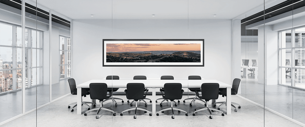
1:3 and 1:5 — These are the panoramic formats — dramatic, wide, and immersive. A 1:5 print in particular commands significant horizontal wall space and tends to work best as a standalone piece rather than part of a grouping. They’re well-suited to open-plan spaces, long walls, or anywhere you want the landscape to feel truly wide.
The Shop allows you to filter by aspect ratio, which makes it straightforward to focus your search on prints that will fit naturally into the space you have in mind.
How orientation follows from aspect ratio
The aspect ratio of a print also determines its orientation — and that’s worth considering alongside your wall space.
Landscape-oriented prints (where the width exceeds the height) suit most walls and are generally the most straightforward to place — above furniture, on wider walls, or in open spaces where a horizontal line feels natural and grounding.
Portrait-oriented prints work beautifully on taller, narrower wall spaces — a stairwell, a hallway, or a wall with limited width but generous height. In rooms with low ceilings, a tall portrait print can feel cramped, so it’s worth considering ceiling height alongside wall width.
The more elongated panoramic ratios — 1:3 and 1:5 — are landscape by nature and tend to work best as standalone statements on long or wide walls, where their full horizontal reach can be appreciated.
Browsing by aspect ratio in the Shop will naturally surface prints in the orientations that suit your space.
Lighting Conditions
Lighting has a greater effect on how a print looks in a room than most people anticipate — the same photograph can feel vivid and present under good light, or flat and recessive under poor light.
Before deciding on placement, consider the light that the wall actually receives throughout the day. Natural light is beautiful but variable — a north-facing wall in the southern hemisphere receives consistent, diffused light that tends to be kind to artwork, while a wall that catches direct sun at certain times of day is a less ideal choice. Direct sunlight will cause glare on glazed frames and, over time, contributes to colour fading regardless of print quality.
Artificial lighting gives you more control. Soft, directional light — from a picture light, adjustable spotlight, or recessed downlight positioned at the right angle — will bring out the texture, tonal depth, and colour of a fine art print in a way that flat overhead lighting simply cannot. If you’re able to plan the lighting alongside the placement, it’s worth doing.
It’s also worth looking at what sits opposite the intended wall. Large windows, glass doors, or bright light sources facing the artwork can cause reflections on glazed and acrylic frames — sometimes significant enough to obscure the image depending on the time of day. If another wall is available, it’s often the simpler solution.
Where reflections are unavoidable, non-reflective glazing is available as a special order. It isn’t offered as standard, but if your space makes it a practical necessity, get in touch to discuss options and pricing.
As a general principle, the goal is consistent, diffused light without direct glare — conditions that let the photograph speak for itself rather than competing with reflections or harsh shadows.
Colours in the Room
A photograph doesn’t exist in isolation — it lives alongside your walls, furniture, textiles, and the light that moves through the space. How it relates to that existing palette is worth thinking through before you commit.
The two broad approaches are harmony and contrast. Choosing a print whose tones echo the colours already present in the room creates a sense of calm and cohesion — a warm-toned landscape in a room with timber, linen, or terracotta, for example, will feel like it belongs rather than arrived. Contrast works differently: a cool, expansive seascape in a room with warmer tones, or a graphic monochrome print in a softly decorated space, can add energy and become a genuine focal point.
Neither approach is more correct than the other — it depends on what you want the room to feel like, and what role you want the artwork to play in it.
What’s worth avoiding is a print that neither harmonises nor contrasts with intention — one that simply competes with its surroundings without resolution. A useful test is to ask whether the print and the room feel like they’re in conversation. If the answer is yes, the relationship is probably working.
The Shop filters allow you to browse by category and location, which can help surface prints with a particular colour character — coastal work tends toward cool blues and silvers, for example, while bushland and golden hour landscapes carry warmer, earthier tones.
Hanging Method
The framed print arrives with D‑ring mount points on the back. The Acrylic Float Frames are delivered with a set of U-channels – one attached to the back of the print and the other to be fixed to the wall.
You can hang it using:
- Wall hooks/U-channels, or
- An art hanging system with a ceiling‑mounted rail and adjustable wires.
More details are available on the About the Product page.
Hanging Height
Getting the height right is one of the smaller decisions that makes a noticeable difference to how finished a room feels.
The standard starting point is eye level — the centre of the print at approximately 150cm from the floor. This is the convention used in galleries and works well in most domestic and professional spaces because it places the artwork naturally in the viewer’s field of vision without requiring them to look up or down to take it in.
When hanging above furniture, the relationship between the print and the piece below it matters as much as the absolute height. Aim for a gap of 15–20cm between the top of the furniture and the bottom of the frame — close enough that the artwork and the furniture feel visually connected, but with enough breathing room that neither crowds the other.
Ceiling height can require both of these guidelines to be set aside. In a room with a particularly high ceiling, hanging at strict eye level can leave an uncomfortable amount of empty wall above the print, making it feel anchored to the floor rather than to the room. In these cases, hanging slightly higher than the standard 150cm centre point tends to feel more resolved — trust your eye over the measurement.
Longevity
A fine art print is a long-term investment, and the materials it’s made from determine how well it holds up over time.
Every print is produced on museum-grade paper, the same standard used for archival and exhibition work where permanence is a priority. The framing includes acrylic glazing with 70% UV protection as standard — sufficient for most interior environments where the print won’t be exposed to prolonged or direct sunlight.
For rooms that receive more light, or where you simply want the greatest possible longevity, acrylic with 99% UV protection is available as an upgrade. The difference is meaningful over the life of a print — higher UV filtration slows the gradual colour shift that affects even well-placed artwork over years of exposure.
This is also worth revisiting in the context of the lighting guidance earlier in this guide: the best protection is a combination of considered placement and quality materials, rather than relying on either alone.
Get in touch to discuss the UV upgrade and pricing.
One Print or Multiple
Both approaches can work beautifully — the choice depends on the wall, the room, and how much visual weight you want the artwork to carry.
A single print, well placed, makes a clear and confident statement. The focus is entirely on the photograph and its relationship to the space around it — which means placement, size, and framing all matter more, not less. The guidance on wall size, viewing distance, and hanging height covered earlier in this guide applies most directly here.
A arrangement of multiple prints distributes that visual weight and can animate a larger wall in a way a single piece cannot. There are several ways to approach it:
Straight row — Prints aligned horizontally at a consistent centre height. Clean and considered; works well with prints of the same or similar size, and suits more formal or architectural interiors.
Grid — Prints arranged in equal rows and columns with consistent spacing. The regularity creates a strong graphic presence and works particularly well with a cohesive body of work — images from the same location or in a consistent colour palette, for example.
Staggered or diagonal — A looser arrangement with deliberate variation in height. More relaxed in character and well suited to informal spaces or a mix of orientations and sizes.
Gallery wall — A freeform grouping of mixed sizes, orientations, and potentially mixed framing. The most expressive approach, but also the one that benefits most from planning — laying the arrangement out on the floor before committing to wall fixings saves a great deal of patching.
In any multi-print arrangement, consistent spacing between frames is what holds the grouping together visually. As a starting point, 5–8cm between frames tends to read as intentional without feeling crowded.
Access to the Premises
It’s a practical consideration that’s easy to overlook until it becomes a problem — large framed prints need enough clearance to be moved through the building to their final location.
Before ordering a larger print, it’s worth checking the dimensions against the narrowest points along the route: doorways, stairwells, and lifts are the most common constraints. A print that fits comfortably on the wall may still present a handling challenge if the access route is tight or involves turns.
The external dimensions and weight of each framed print are listed under the Additional Information tab on the individual product pages in the Shop — check these against your access route before placing your order, particularly for the larger sizes. Bear in mind that packaging will add to these measurements, so it’s worth allowing a little extra clearance when assessing tight access points.